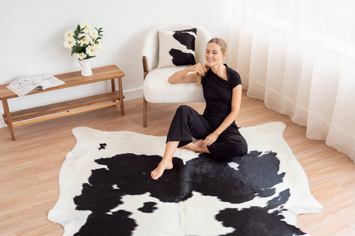
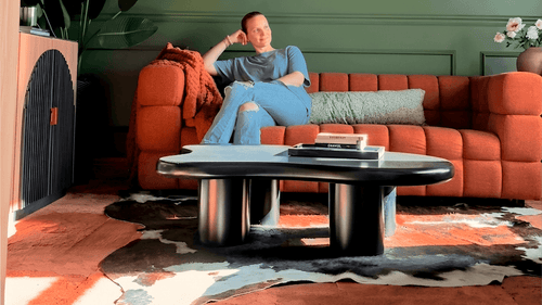
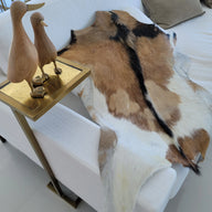
The conventional advice about cowhide rugs is that they're versatile neutrals — that they go with everything, work in any room, require no real thought beyond size and pattern. That's half right. Genuine natural hide is versatile. But the best versions of these rooms — the ones that stop you in the doorway — aren't accidents of compatibility. They're the result of pairing a specific hide with a specific palette and understanding why those two things make each other better.
Five combinations. Five different rooms. Five different design logics. All of them built around Cowhide Rugs in a bold color context — which is exactly where the material does its most interesting work.
Champagne & Chocolate: How Warm Neutrals Turn a Dark Room Into Something Rich

The pairing: a Champagne Cowhide Rug on a forest green floor area rug, beneath a deep chocolate brown sofa, against a dark backdrop — with paint chips that read Dried Straw, Limed Gum, and Cocoa.
This is the warm neutral move done at maximum depth, and the logic behind it is more deliberate than it looks. A chocolate brown sofa in a dark room risks disappearing — the tones absorb into each other and the room reads flat. The champagne hide solves that by introducing the lightest element in the room at floor level. The golden, warm-beige surface of a champagne cowhide against a dark chocolate sofa creates a tonal step — a shift in value that gives the eye somewhere to land.
The forest green area rug beneath the cowhide is what makes the full layering work. The green adds a third tone in the warm-dark register — not competing with the chocolate, not matching it, but sitting adjacent to it on the color wheel in a way that creates richness without color conflict. The champagne hide floats on top of both: lighter, warmer, organic in shape against the rectangular green base. The BHG How to Layer Rugs guide and 5 Tips for Layering Rugs cover the mechanics of this approach well.
The Dried Straw / Limed Gum / Cocoa palette in the moodboard is a masterclass in tonal control. Three colors — one warm light, one dark green, one deep brown — all pulling from the same earthy, saturated register. The champagne hide belongs in this palette not as a contrast element but as its lightest member, the piece that prevents the room from going entirely dark.
The rule this combination demonstrates: In a room built on depth and warmth, introduce your lightest element at floor level. It grounds the room without competing with the drama above it. Champagne Cowhide Rugs and Beige Cowhide Rugs are both worth considering for this context. For wall color pairing guidance, the Rug Color Guide at Chris Loves Julia is the best reference.
"Dark rooms need a light anchor — usually at floor level, where the eye naturally rests. A champagne or beige cowhide in a room built on chocolate, green, and deep warm tones is that anchor. It prevents the room from collapsing into itself visually, and the natural organic shape of the hide adds the movement the room needs." — Isabelle Fontaine, Principal Designer, Fontaine Interiors, New Orleans LA
Black Cowhide & Mustard Yellow: The High-Contrast Pairing That Owns Every Room It's In

The pairing: a Black Cowhide Rug anchoring a space with mustard yellow walls, a mustard velvet chair, and bold abstract art — the Sun Yellow / Black / Domino paint palette.
This is the most maximalist combination in this guide and the one that rewards commitment most. The logic: black and mustard yellow is one of the classic high-contrast complementary pairings in design history — both colors are saturated, both are strong, and instead of fighting they amplify each other. Black makes yellow look more luminous. Yellow makes black look more intentional. On a floor, a solid Black Cowhide Rug under a mustard yellow chair creates a relationship between floor and furniture that reads as designed from the first moment you enter the room.
The abstract art in this moodboard — black line on mustard ground — is what connects the two planes. The same color story happening on the wall in art form, on the chair in upholstery, and on the floor in natural hide: a room where every element is speaking the same language. The Domino (taupe-brown) in the palette adds the grounding tone that prevents the yellow-black combination from reading as graphic design rather than interior design.
What makes this work at the hide level specifically: a solid black natural cowhide has a depth and texture that no painted or dyed surface can replicate. The way the hair catches light differently from different angles — the subtle shifts between jet and brown-black depending on direction — is what elevates this from a graphic exercise to a material one. The hide is black, but it's never flat. That's the difference between genuine natural hide and any printed alternative.
The rule this combination demonstrates: When using a high-contrast color pairing, let the floor be the darkest element. It grounds the drama rather than competing with it. The 2026 Interior Design Trends post covers the black hide moment in detail.
"Black cowhide with mustard yellow is an unexpected pairing that works because both colors are utterly committed to themselves — neither is trying to be subtle. On the floor, the hide provides the darkness that makes the yellow above it look even more alive. It's a combination that demands confidence, and rewards it." — Marcus Webb, Interior Designer & Color Consultant, Atlanta GA
Dark Brindle & Dusty Blue: The Unexpected Combination That Makes Both Colors Better

The pairing: a dark Brindle Cowhide Rug — almost entirely deep chocolate with rich auburn undertones — alongside a dusty blue sofa, a cognac leather chair, and warm light wood furniture. The Black Leather / Mocha Icing / Fashion Denim palette.
This is the combination that surprises people most — and the one that designers come back to most consistently. Dusty blue and warm dark brown shouldn't work together as well as they do. They sit far apart on the color wheel, they have different temperatures, and in the wrong combination they create an incoherent room that feels like it can't decide what it is. In the right combination, they create a room that feels like it's been thoughtfully curated over time — the warmth of the brindle and the coolness of the blue creating a tension that reads as richness rather than conflict.
The key to making it work is the bridge tone. In this moodboard, Mocha Icing — a warm caramel brown — is the palette entry that connects the dusty blue sofa and the dark brindle hide. The cognac leather chair carries the same warm tan family. When the warm mid-tones bridge the cool blue and the dark brown, the room stops feeling like two separate decisions and starts reading as one intentional palette.
Dark brindle is specifically the right cowhide pattern for this context. The characteristic dark-dominant, auburn-streaked surface of a deep brindle has enough warmth to work alongside the blue without fighting it, and enough darkness to anchor the room as a grounding element rather than a competing one. A lighter brindle or a tricolor would shift the balance — the warmth would become too prominent and the cool blue would feel isolated. Dark brindle sits in exactly the right register. The Cowhide Placement 101 Guide covers how to position the hide within a mixed-tone room like this one.
The rule this combination demonstrates: When pairing warm and cool tones, find the bridge. The mid-tone that belongs to both temperature families is what makes the room cohere. Without it, you have contrast. With it, you have depth.
"Dusty blue and dark brindle cowhide is a combination that looks accidental and feels deliberate. The warmth of the hide stops the blue from reading as cold; the blue prevents the warm tones from going cloying. Between the two, you get a room that feels like it evolved naturally — which is the highest compliment any interior can receive." — Sofia Carvalho, Interior Designer, Carvalho Design Studio, Miami FL
Orange Dyed Cowhide & Navy: The Boldest Floor-to-Wall Combination in the Collection

The pairing: an orange Color Dyed Cowhide Rug — full Clementine saturation — against navy blue sofa upholstery, orange textured walls, a pendant light in the same orange, and the Navi / Clementine / Country White palette.
This is the complementary color pairing taken to its logical extreme — and the most visually committed room in this guide. Orange and navy are directly complementary on the color wheel, which means they don't just work together, they intensify each other. Navy looks deeper and more saturated next to orange. Orange looks brighter and warmer next to navy. A room built on this pairing is, by definition, a room that makes a statement.
What makes an orange dyed cowhide the right floor piece for this context is the same thing that makes it a specific choice rather than a generic one: the organic shape of a natural hide in a solid saturated color does something a rectangular dyed rug can't. The irregular silhouette introduces movement into what could otherwise be a graphic, almost institutional, color arrangement. The hide is orange, but its edges are alive — they soften the geometry of the room and remind you that this is a natural material wearing a bold color, not a manufactured object designed to be graphic.
The Country White in the palette is the essential release valve. Without a light neutral, this combination would be oppressive — the orange and navy competing for dominance at the same visual intensity. The white in the side table, the light-neutral vase, and presumably the ceiling and trim provides the visual breathing room that makes the boldness readable rather than overwhelming. The Decorate a Room Guide covers how to balance bold color with neutral reset zones.
For a more accessible version of this pairing, a Red Dyed Cowhide Rug with navy upholstery delivers the same complementary energy at a slightly lower temperature — or a natural Tricolor Cowhide Rug against deep navy walls gives the warm-cool tension without the saturated dye commitment.
The rule this combination demonstrates: Complementary color pairings need a neutral third element to breathe. Orange and navy are both complete colors — add white, cream, or warm natural wood as the release valve, and the intensity reads as intention rather than chaos.
"The orange dyed cowhide and navy combination is the room that gets photographed the most in my portfolio. It works because the complementary pairing is doing exactly what it's supposed to — each color makes the other more itself. The hide's organic shape is what keeps it from looking like a logo. That natural silhouette is everything." — Priya Anand, Senior Interior Stylist, Anand Design Group, New York NY
Zebra Safari & Burgundy: How to Make Animal Pattern Feel Elevated, Not Loud

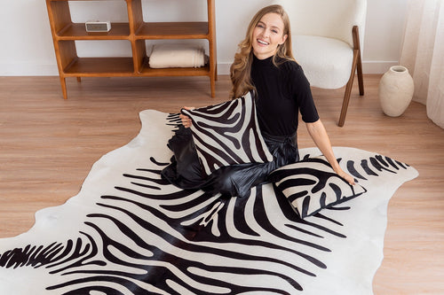
The pairing: a Animal Print Cowhide Rug — specifically a Zebra Safari Cowhide Rug with warm caramel and black stripes — in a bedroom with burgundy bed linens, warm wood wardrobe and nightstand, Ivory walls, and the Pinot Noir / Wood / Ivory palette.
Zebra print has a reputation problem. In the wrong context it reads as costume — too referential, too literal, too 2004 safari-chic. In the right context it's one of the most sophisticated animal pattern applications in residential interiors, and this moodboard shows exactly what that context looks like.
The reason this works is restraint applied everywhere except the hide. The bedroom is built on three tones that don't compete: burgundy (deep, wine-dark, saturated), warm wood (natural, consistent, grounding), and ivory (light, clean, simple). None of these three tones is trying to be a visual statement on its own. They're all quiet enough that the zebra print on the floor can be the one thing that isn't quiet — the single bold move in a room that otherwise practices restraint.
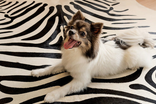
The caramel warmth in this particular zebra pattern is what bridges it into the burgundy-and-wood palette. A pure black-and-white zebra in this room would feel cooler and more graphic — it would sit slightly outside the warm family the rest of the room inhabits. The caramel undertone pulls it back into the warm register, making the hide feel like it belongs in this palette rather than being imposed on it. The Zebra Safari is the specific piece that achieves this. For a more graphic version, the Zebra Cowhide Rug delivers the full contrast of the classic stripe.
The bedroom context is also important. Animal print reads more sophisticated in a bedroom than in a living room because the bedroom is already a more personal, layered space — the rules are more relaxed, the expectation of restraint is lower, and the mix of textiles (the knot pillow, the throw, the linen bedding) provides enough softness to absorb the pattern without letting it dominate. The Animal Print Interiors trend coverage confirms this pattern is moving further into elevated residential design in 2026, not away from it.
The rule this combination demonstrates: Animal print earns its place through surrounding restraint. Let one thing be bold — the hide — and keep everything else in a controlled, quiet palette. The pattern does the work; the room's job is to not compete with it. Add a Zebra Cowhide Pillow on the bed for the only other pattern in the room — same material family, different scale, restrained repetition.
"The mistake with zebra print is giving it too much company. It doesn't need help — it needs space. Burgundy, warm wood, and ivory give it exactly that: a palette that's rich enough to deserve the pattern, quiet enough not to fight it. That's the version of animal print that reads as sophisticated rather than loud." — Elena Vasquez, Interior Designer & Pattern Specialist, Los Angeles CA
The Principles Behind Every Combination That Works

Five different pairings, five different design logics — but the same underlying principles appear across all of them.
Temperature coherence matters more than color matching. The champagne-chocolate, dark brindle-dusty blue, and zebra-burgundy combinations all work because the hide sits in the same temperature register as the dominant room palette — or deliberately bridges two temperature zones (as the dark brindle does between cool blue and warm leather). Getting temperature wrong is harder to fix than getting pattern wrong.
The hide's organic shape is a design tool. In the orange-navy and the zebra-burgundy rooms especially, the irregular silhouette of a natural hide does spatial work that a rectangular rug can't — it introduces organic movement into color-committed spaces that might otherwise read as graphic or rigid.
Bold color rooms need a neutral release valve. Every combination here includes at least one quiet element — the Country White in the navy room, the Ivory in the burgundy bedroom, the cream walls in the brindle-blue room. The bold elements earn their intensity because something in the room doesn't compete.
Browse the full collection — Champagne Cowhide Rugs, Black Cowhide Rugs, Brindle Cowhide Rugs, Color Dyed Cowhide Rugs, and Animal Print Cowhide Rugs — at eCowhides.com. For the complete palette-matching approach, the Decorate a Room Guide and the Rug Color Guide at Chris Loves Julia will take you the rest of the way.
FAQ: Cowhide Rugs With Bold Colors Edition
What Cowhide Rug Works Best With Dark Green Walls?
Warm natural tones — Champagne Cowhide Rugs, Tricolor Cowhide Rugs, and Brindle Cowhide Rugs — work best with dark green walls. The warm tones in these hides sit in the same earthy register as most deep greens, creating richness rather than contrast. Lighter patterns like champagne or beige provide the value lift that prevents a dark room from going flat.
Can I Use A Cowhide Rug With Navy Blue Walls Or Furniture?
Yes — and several hide types work beautifully in this context. Color Dyed Cowhide Rugs in orange or red create the maximum complementary contrast. Natural warm hides — tricolor, brindle, or brown and white — provide a warmer, more understated pairing. Black and White Cowhide Rugs deliver a graphic, high-contrast contemporary combination. Add warm metal accents (brass, copper) to bridge the navy and natural hide tones.
What Cowhide Rug Works With A Mustard Yellow Room?
A Black Cowhide Rug is the most dramatic and intentional pairing — black and mustard yellow are directly complementary and intensify each other. For a warmer, less graphic approach, dark Brindle Cowhide Rugs provide the dark grounding element the mustard room needs without the maximum contrast of solid black.
What Cowhide Rug Works With A Burgundy Or Wine-Colored Room?
Animal Print Cowhide Rugs — particularly warm-toned zebra — are a strong pairing with burgundy, especially in bedrooms. The key is choosing a pattern with warm undertones (caramel rather than pure black-and-white) so the hide sits in the same warm family as the wine tones. Natural tricolor and dark brindle also pair well with burgundy for a more understated approach.
Can I Use A Colored (Dyed) Cowhide Rug In A Bold Room?
Yes — but the styling rule changes. In a bold room, a dyed cowhide becomes the dominant element rather than an accent. Let it be the anchor and keep everything else relatively restrained — neutral walls, simple furniture, minimal competing pattern. The orange-and-navy room works because the orange dyed hide and the navy upholstery are in direct conversation, with white as the release valve. Every other element in the room is quiet enough to let that conversation happen.
Does Cowhide Work With Dusty Blue Or Steel Blue Walls?
Yes — this is one of the more sophisticated combinations available. Dark Brindle Cowhide Rugs work particularly well — the auburn and dark brown tones provide warmth that prevents the blue room from reading as cold, while the brindle's tonal complexity prevents the combination from feeling like a simple warm-cool opposition. Add a mid-tone bridge element (cognac leather, warm wood, caramel textiles) to connect the two temperature zones.
What Is The Best Cowhide Rug For An Orange Room Or Orange Walls?
Two approaches: lean into the orange with a natural warm hide (tricolor, champagne, or brindle all sit in the orange room's temperature family) for a tonal, layered room. Or create maximum contrast with a Black Cowhide Rug or Grey Cowhide Rug for a graphic, high-contrast room where the floor and walls define opposite poles. Both work — the choice depends on whether you want a room that feels rich (tonal) or designed (contrast).
How Do I Style A Cowhide Rug In A Room With Bold Wall Colors Without Overwhelming The Space?
Three rules: match the hide's color temperature to the dominant wall tone, include at least one neutral element that provides visual relief (white, cream, warm wood), and let the hide be one of no more than two bold elements in the room. A bold wall with a bold hide and bold furniture is too much. A bold wall with a bold hide and restrained furniture is a considered room. The Decorate a Room Guide walks through the balance approach in detail.
Can Zebra Print Cowhide Work In A Bedroom?
Yes — and the bedroom is one of the strongest contexts for it. The more personal, layered nature of a bedroom space absorbs animal print more naturally than a formal living room. The key is surrounding restraint: keep wall color, bedding, and furniture in a controlled palette (burgundy, ivory, and warm wood, for example) so the zebra hide is the single bold move in an otherwise quiet room. A matching Zebra Cowhide Pillow on the bed provides the only pattern repetition the room needs.
What Is The Easiest Bold Cowhide Color Combination For A First-Time Buyer?
Dark brindle with dusty blue or navy furniture — it's the combination with the widest margin for error. The warm-cool tension is inherent to the pairing and almost self-correcting: the hide warms what the blue cools, and the blue anchors what the warm tones might otherwise make too cozy. Add warm wood furniture as the bridge tone and the room works reliably across a wide range of execution. Brindle Cowhide Rugs are also the most forgiving pattern for everyday life — the tonal complexity hides wear, dust, and light debris between cleanings.
Find the Combination That Belongs in Your Room

Every room in this guide starts with a cowhide and builds outward — or starts with a bold palette and finds the hide that makes it land. Either direction works. What doesn't work is choosing a hide without understanding why it belongs in the specific room it's going into.
Browse the complete collection — Champagne, Black, Brindle, Color Dyed, Animal Print, and the full Best Seller Cowhide Rugs — at eCowhides.com. Know your room. Find the hide. The rest follows.